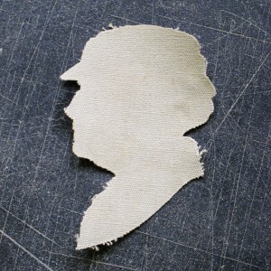
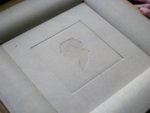
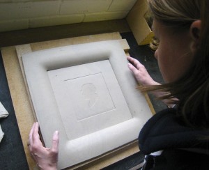
I thought I’d show you some colour samples fresh from the kiln that I’m testing out for the silhouette dish. I’m trying various combinations of black and white with reference to the original, paper cut silhouette.
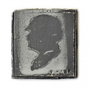
Dark grey slip with white over
I need to take more care when applying the resist to mask out the head as the resulting edge isn’t crisp enough. I need that edge to make the same visual impact as the paper cut edge of the original.
I am considering using a touch of glaze, perhaps just on the head, perhaps just as an incidental splash, to draw out some further contrasts and animate the surface with reflected light. However, on this test the glaze has drawn out the black pigment in the grey slip too heavily and shifted the focus from the head to the glaze splash, so I can see I need to be careful how I handle this.

Red clay, grey slip with white over and a splash of glaze
I normally work with a white clay base as it shows colour well but I have also recently been working more with red terracotta. I like the bold colour contrast of the red clay with the black slip and this particular combination gives a cleaner edge around the profile when the black is rubbed away.
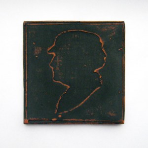
Red clay with black slip
However, I have found that the red clay warps much more than the white through the drying and firing process (no matter how careful I am!) so I have tried using a red slip on the white clay. Whilst this solves the warping problem the colour combination isn’t quite as dramatic. So blending red clay with white, or buying a grogged red clay might be the next step if I choose this palette. I also turned Mary round so she’s looking back at us, or with an idea that there could be two, one facing the other!
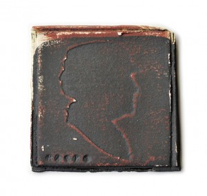
White clay, red slip, black slip over
The tests have also shown me that I’ve lost the detail of the netting around the brim of her hat and I need to think about whether this is important and if it is how I can bring it back. Either some other form of mark making in the clay or other forms of finishing post firing such as glaze, enamel or transfer. I was already planning some transfer lettering for the inscription, so this may be an option if I think it’s necessary.
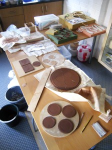
Decisions about the work are made through the sample making process and all the samples are made with a question in mind, testing out the theories (as theory is often very different in practice!), considering the options, feeling confident that the right choices are being made. As I move towards resolution, I need to feel sure that the final piece is the best it can be.
Perhaps if you are reading this you might care to comment on some of these deliberations. As the idea is still in progress you have an opportunity to affect the outcome. All tutorial advice will be carefully considered! Sharon





Comments